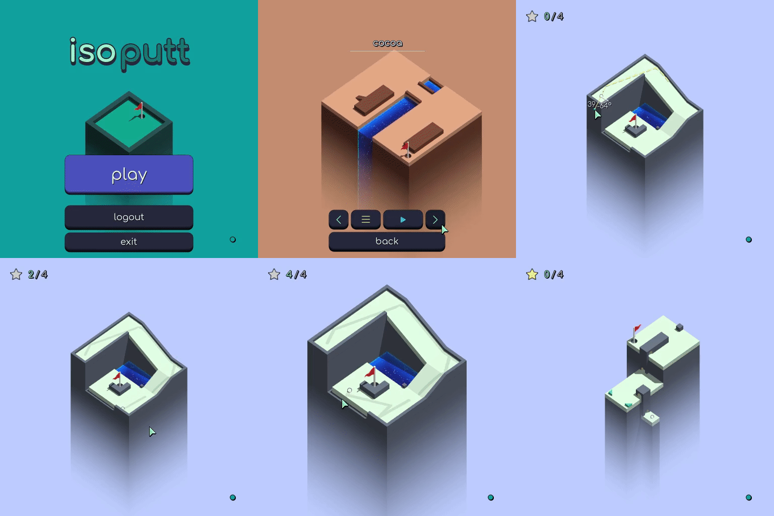
Menu Polish in IsoPutt

Color palette swapping makes this menu come alive.
I’ve been working on the menus for IsoPutt for almost 4 months now. It can be hard to stay motivated when working on “boring” stuff like this! It’s not as exciting as working on new gameplay features or coding elaborate systems…
But I’ve seen first hand how much impact this has had on the way people perceive the game. When you have an ugly menu, you kind of start “in debt” when the player makes it to the gameplay. The gameplay has to overcome that “menu debt” before it can be judged on it’s merits. When you have a nice menu, players seem to have a less critical, more open, mindset.
I’ve noticed play testers playing longer, and expressing more joy now that I’ve improved the menu systems.
The changing color palettes serves as a tangible reward for having completed a course. It feels like the menu system was the X factor that IsoPutt has been needing.
This has all come together towards a lesson of going deep into your game’s design, and refusing to get caught into the trap of breadth.
I’m closing in on having a releasable product…